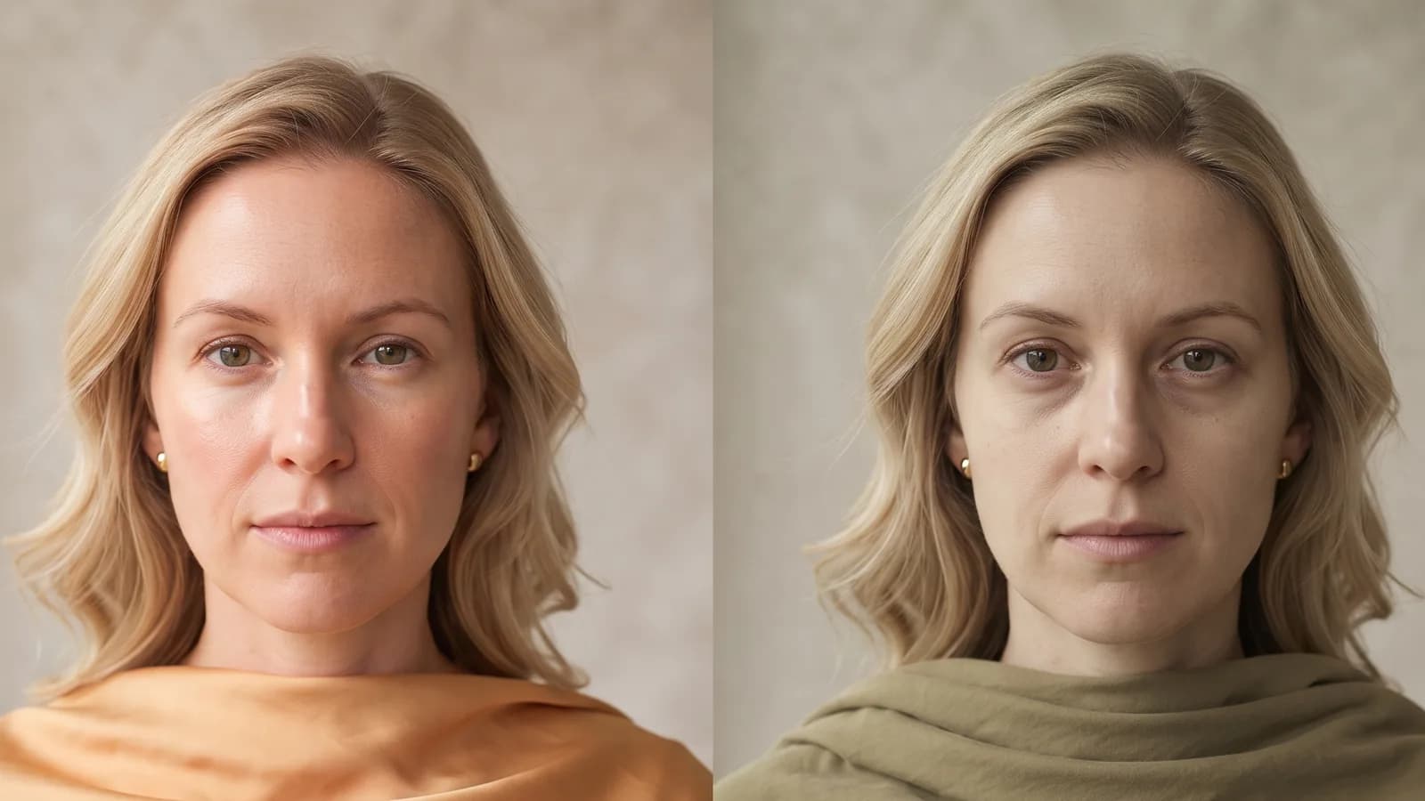
A colour is rarely bad in isolation — it hurts when it fights your skin's signal or the situation.
Key takeaways
- A colour hurts in two independent ways: social (how you are perceived) and optical (how your skin looks).
- Optical fatigue is the effect of a colour casting a green-yellow tint onto the face and deepening under-eye shadow (Stephen/Perrett facial-colour work).
- No colour is universally banned — the problem appears only in relation to your undertone and contrast.
Colours that make you look tired are not a mystical list but two quite different mechanisms worth separating. A shade can work against you socially — changing how you are perceived — or optically, changing how your skin looks. These are two separate problems with separate solutions, and confusing them leads to useless bans of the never wear black variety. Let us take it apart honestly.
Social: black, dominance and its cost
Frank and Gilovich (1988) analysed team kit in professional leagues and observed that teams in black uniforms drew more penalties than others — and in a companion study, the same plays in black were rated as more aggressive. This suggests black is sometimes read through a lens of dominance and aggression. But that is only half the picture: the same black in another context reads as elegance, gravity and status. A colour has no single meaning — it has meanings that depend on the scene.
Social: red where you are being judged
Andrew Elliot, within the colour-in-context tradition, showed that red can work against you in evaluation and achievement settings — in test-like or task contexts, exposure to red was linked to weaker performance, probably through its association with error and threat. The same shade that reads as approach on a date can act as a warning when you are being assessed. Again: the colour is not bad, the fit to context is.
Optical: why the wrong colour adds fatigue
Here the mechanism is physical, not social. Healthy-looking skin rests on two colour signals: carotenoid (yellow-gold, from diet) and haemoglobin (pink-red, from blood flow). Stephen and Perrett's work on facial colour found that faces with higher saturation of these tones were rated as healthier. A wrong garment colour fights that signal:
- it casts a green-yellow reflection onto the skin, cancelling the healthy pink;
- it flattens contrast, so features and under-eye shadow come forward;
- it drains light from the face when it is too heavy for a low-contrast colouring.
The effect is not age written into the colour, but a weakening of the signals the brain reads as freshness.
The most problematic colours by undertone
With the caveat that these are tendencies, not bans: cool undertones tend to struggle with warm, muddy yellows and mustard, which push the green in skin forward. Warm undertones can find icy, greyed pastels uncomfortable, as they drain warmth from the face. Very fair, low-contrast complexions can lose light to a heavy black. These are starting points to check, not verdicts.
The myth: some people must never wear black or white
That is an over-generalisation. The truth is narrower: a given tonal version of black or white may not serve you, but the fix is usually to change the shade or move the colour away from the face — a scarf, lapels, an intermediate layer in your good colour — not a lifelong ban. White broken to bone or cream, black softened by texture: same colour family, different effect.
How to avoid the mistake
Three moves that eliminate most errors:
- Contrast: match the strength of the pairing to your skin–hair–eye relationship, not to a trend.
- A daylight try-on: artificial light lies about undertone; judge by a window.
- Draping: lift the fabric under the chin and watch whether shadows recede or deepen.
Colour meanings are also culturally variable — black, white and red carry different associations across cultures — so read the social context locally and the optical effect in the mirror.
References
- Frank, M. G., & Gilovich, T. (1988). The dark side of self- and social perception: black uniforms and aggression in professional sports. JPSP, 54(1), 74–85. DOI
- Elliot, A. J., & Maier, M. A. (2012). Color-in-context theory. Advances in Experimental Social Psychology, 45, 61–125. DOI
- Stephen, I. D., Coetzee, V. A., & Perrett, D. I. (2011). Carotenoid and melanin pigment coloration affect perceived human health. Evolution and Human Behavior, 32(3), 216–227. DOI