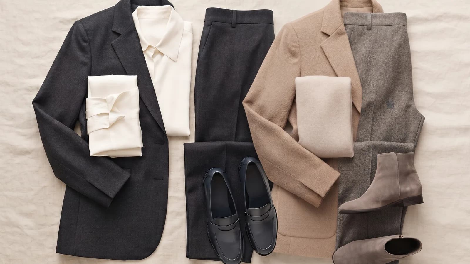
Hue draws the eye, but value most often settles whether a colour cooperates with the face.
Key takeaways
- Colour has three dimensions (the Munsell model: hue, value, chroma), and it is value — lightness — that usually decides the most.
- Your natural contrast is the lightness relationship between skin, hair and eyes; it sets how strong your pairings should be.
- Two people of the same season can need different sets, because they differ in contrast, not only undertone.
Personal colour contrast is a concept that does more work in colour analysis than any fashionable hue, though it reaches the covers less often. To see why, return to the three dimensions of colour in the Munsell model: hue (the shade itself, red vs blue), value (lightness, from white to black) and chroma (saturation, from grey to pure colour). Popular advice fixes on hue — warm or cool — but in practice value most often settles whether an outfit enlivens the face or flattens it.
Your natural contrast
Natural contrast is the lightness relationship between three elements: skin, hair and eyes. A person with fair skin and very dark hair has high internal contrast. A person with fair skin and light blonde hair has low contrast, because all the values sit close together. This is not a matter of better or worse looks, only of the lightness arrangement the face already wears. And it is precisely that arrangement the clothing should match.
Perception: figure-ground and simultaneous contrast
Why this works at all is explained by classic vision science. The figure-ground principle holds that vision separates an object from its background on the basis of difference — and the largest difference is usually made by lightness, not by hue. Simultaneous contrast adds a second layer: the same colour looks different depending on what surrounds it; a light background deepens a dark object and the reverse. Translated to dress: a set that contrasts too strongly or too weakly with your face pulls attention onto the clothing and drains life from the features.
High and low contrast in a set
From this follows a simple mechanics of selection:
- High personal contrast carries strong lightness pairings — white with navy, a light top with a dark bottom. Too muted a set will make a high-contrast face look underdressed.
- Low personal contrast works better with tone-on-tone sets and gentle transitions. A sharp black-and-white contrast against low personal contrast can overwhelm the features and draw the eye to the line of the clothing rather than the face.
This does not mean anyone cannot wear black with white — it is about where you place that contrast and how close to the face.
Why two people of the same season need different sets
Seasonal systems group people mainly by undertone and colour temperature. But two people of the same season can have entirely different internal contrast — one fair-skinned with dark hair, the other fair-skinned with light. The same lipstick or jumper shade works differently on them, because value separates them, not hue. So the season is the start of the conversation, not its end: contrast writes the rest.
Practice: building outfits by contrast level
Instead of thinking in colours, think in levels of lightness:
- Establish your personal contrast: compare the lightness of skin, hair and eyes by a window.
- Match the strength of the set to that relationship — strong contrast to strong, gentle to gentle.
- Keep the strongest contrast where the face should work, that is, at the neckline.
- Check the effect in daylight: watch whether the eyes come forward or hide behind the clothing.
You choose the hue last — because once value has set the scene, hue is only the casting in a well-lit role.
References
- Munsell, A. H. (1905). A Color Notation. Boston: Ellis.
- Zasady percepcji: kontrast równoczesny i figura–tło (klasyczna nauka o widzeniu).