Your undertone is a stable biological property of your skin, easily confused with a passing surface colour and even more easily mismeasured.
Key takeaways
- Undertone is the fixed inner cast set by your pigment mix; surface tone (overtone) shifts with tan, flush and season.
- Three pigments drive the impression of warmth and coolness — melanin, haemoglobin and carotenoids — not one.
- The vein test is unreliable and phone screens distort colour through metamerism; a trustworthy reading needs neutral daylight or a calibrated camera.
Undertone versus surface tone — what it actually means
Skin undertone is the stable inner cast that shows through the surface whether you are tanned or pale. It is worth separating from what sits on top — the surface tone, or overtone. The overtone is a passing layer: it darkens in sun, reddens in cold, exertion or irritation, and drifts with the season. The undertone stays put.
This distinction has a practical payoff. If you choose colours to suit a temporary skin state, any hit is accidental and stops working once the tan fades. The undertone is the steadier reference point.
The biology: melanin, haemoglobin and carotenoids
Skin colour does not come from a single dye. It is built mainly from three pigments, and what we read as warmth or coolness is the net result of their proportions.
- Melanin — the pigment made in the epidermis; it carries brown and depth and pulls skin towards warm, earthy tones.
- Haemoglobin — the pigment of blood in the skin's vessels; it brings red and pink, and gives many fair complexions their cooler, rosier character.
- Carotenoids — pigments from the diet that deposit in the skin and add a yellow-gold, warm accent.
Undertone, then, is not a label but the sum of three variables. That is why two people of similar skin lightness can read as clearly different undertones — a different share of haemoglobin and carotenoids.
Warm, cool, neutral, olive — how each looks
Four working categories organise what you see:
- Warm — a golden, peachy, yellowish cast; melanin and carotenoids lead.
- Cool — a pink, reddish, faintly bluish cast; haemoglobin has the larger share.
- Neutral — no decisive lean; warmth and coolness roughly balance.
- Olive — a subtle greenish-grey veil on the surface that can mask the underlying direction; it often coexists with a warm tone.
These are aids, not rigid boxes. Most people sit somewhere on a scale rather than in a pure type.
Assessment methods that work
A sound reading starts by controlling conditions, not by staring at skin under whatever light is to hand.
- Neutral daylight — judge by a window, in diffuse light, away from coloured walls. Artificial light — warm bulbs, cold LEDs — shifts perceived colour.
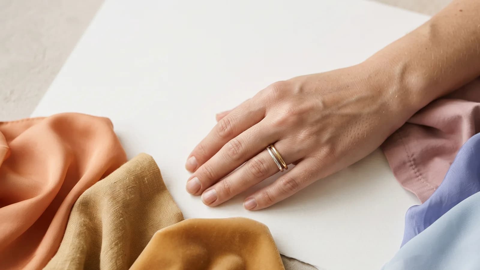
- A white sheet — hold a sheet of clean white beneath the face. Against it, skin reveals its direction: yellow-gold (warm) or pink-red (cool).
- Gold versus silver — compare the two metals at the face. One usually lifts the complexion, the other flattens it or greys it. That is a signal of direction, not a verdict.
- Draping — trying fabrics in different hues; the right colour evens the skin, the wrong one deepens shadows and fatigue.
Popular tests that fail
Here we must separate what is supported from what is not. The vein test — judging whether the wrist vessels look blue (cool) or green (warm) — is unreliable. The colour you see depends on vessel depth, the thickness and light-scattering of the skin above them, and the lighting; it is the physics of skin layers more than a readout of your undertone. Treat it, at best, as a weak hint, not proof.
The second trap is screens and filters. A phone photo passes through white balance, correction and compression; a selfie under different light gives a different answer. The phenomenon behind this is metamerism: two samples that look identical under one light diverge under another. That is why a reading off a screen is unstable, and filters void it entirely.
Undertone in practice: colours, metal, base
Once you know the direction, decisions get simpler:
- Clothing colours — warm undertones usually gain from warmed, muted hues (mustard, terracotta, warm green); cool undertones from clean, cool ones (cornflower, raspberry, silvery grey).
- Jewellery metal — gold more often supports warmth, silver and white support coolness; treat this as a starting point to verify by draping.
- Makeup base — the commonest error is a foundation with the opposite undertone: a warm base on cool skin can look mask-like, and the reverse holds too.
Research on facial perception (Stephen, Perrett) indicates that subtle shifts in skin coloration affect impressions of health and vitality — which is why matching to undertone works, even if the effect is often understated.
When it is worth letting a camera or algorithm judge
The human eye is superb at comparisons but poor at absolute values, and it is easily fooled by context. If you want repeatability rather than an impression, it is worth handing the measurement to a tool — provided it controls the light and white balance. A calibrated camera with a white reference neutralises the metamerism that the naked eye cannot work around. This does not replace taste; it only takes the accident of lighting out of the equation.
References
- Stephen, I. D., Coetzee, V. A., & Perrett, D. I. (2011). Carotenoid and melanin pigment coloration affect perceived human health. Evolution and Human Behavior, 32(3), 216–227. DOI
- Stephen, I. D., Law Smith, M. J., Stirrat, M. R., & Perrett, D. I. (2009). Facial skin coloration affects perceived health of human faces. Int. J. Primatology, 30, 845–857. DOI