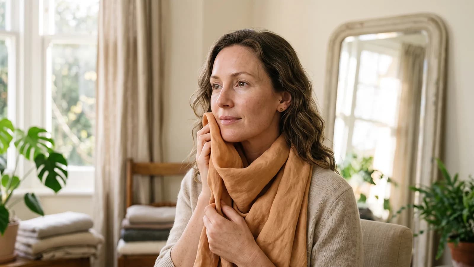
You try on a sweater in a shop that looked stunning on an Instagram influencer. At home, in your own mirror, you look like you haven’t slept in three days. The colour is the culprit — it doesn’t work with your skin. Good news: you can work out your own colour type by this afternoon. And if you’d rather have absolute certainty, I know exactly what a professional analysis costs and what to expect from it. I’ve written separately about what’s science and what’s myth in colour analysis. Here, we stay practical: how to run the test step by step, and when to trust yourself versus call in help.
Before you stand in front of the mirror
Whether you’re testing at home or in an app, the result depends on light more than on technique. The standard for "daylight" in photography sits in the 5,000–6,500 K range. In practice: stand by a window on a bright day, out of direct sun and away from heavy cloud. Take off your makeup — even light foundation changes what you see on your skin. Pull your hair back, and if it’s dyed, cover it with a neutral scarf. Hair colour throws off an undertone reading just as easily as the wrong blush. Wear something neutral — white, grey, beige, no patterns. And skip the test if you’re tanned: if you’ve just come back from the coast, wait a few weeks.
Home draping, step by step
- Start with metal. Hold gold and silver jewellery — or fabric in those tones — against your face, alternating between them, and watch yourself, not the metal. Does your skin brighten, turn healthy and pink? Or does it grey, go sallow, even a little blue?
- Move to the warm palette. Hold fabric or clothing in gold, apricot, olive under your chin. Watch your jawline, the shadows under your eyes, the overall glow of your skin.
- Move to the cool palette. Silver, icy blue, cool pink — the same test, the same attention.
- Compare the effect, not your taste. Notice which colour genuinely lifts your face, even if it’s nothing like what you’d normally wear. The right colour brightens your complexion and gives you energy; the wrong one deepens shadows and makes you look tired, even after ten hours of sleep.
The most common mistakes with a DIY test? Taking photos across several sessions, since the camera resets its white balance every time you close the app. Picking your favourite colour instead of the one that actually works. And testing with makeup or a tan still on your skin.
Supporting tests — and why none of them deserves complete trust
The white paper test. Hold a plain white sheet of paper against your face in natural light. Does your skin look pink or red against it? That points to a cool undertone. Yellow or gold? That’s warm. A decent starting point — but only a starting point. I’ve covered skin undertone and its unreliable tests in more depth here.
The gold-versus-silver test. Popular, intuitive — and, I’ll say it plainly, it only works for about 30% of cases: 4 of the 12 colour types (warm spring, warm autumn, cool summer, cool winter). For the other eight, something else decides it — muting and depth of colour, not temperature alone. That’s why some women feel like "sometimes gold works, sometimes silver." They’re right: the metal test on its own isn’t enough.
The wrist-vein test. The sources disagree here, so I won’t pretend otherwise. Some stylists read vein colour as an undertone signal. Others call it unreliable — melanin in the skin changes how veins appear, regardless of your actual type. I treat this one as the weakest link of the set. More on why it falls short, in the piece on undertone.
If you’re still unsure after these tests — especially if your colouring sits "between" two seasons — the issue is sometimes contrast, not temperature, and a home metal test simply doesn’t measure that.
A professional analysis with a stylist
If you want certainty rather than just a signal, this is your route. The prep looks much like the home version: makeup off, neck bare, dyed hair covered with a neutral scarf, so nothing distorts how the colour reads. The stylist holds sets of fabric under your chin in turn — warm (gold, apricot, olive) and cool (silver, ice, pink) — watching for exactly what you watched for at your window: does the skin come alive, or grey out. The difference is in the experience, and in what happens after the session.
The in-studio visit itself runs about 2.5 hours: conversation, draping, working through makeup. Behind the scenes, the stylist puts in a few more hours of her own building your palette and fan deck — so each client really accounts for 6–7 hours of her work.
Prices in Poland: an in-studio analysis runs 450–900 zł (Polish market), usually with a fan deck included. Some concrete examples: 550 zł with Nikoleta, or 650 zł for the analysis alone and 1,000 zł with the fan deck with Joanna Dejneka. The online version, based on photos you send in, runs 150–450 zł — cheaper and easier, but the result depends almost entirely on the quality of those photos.
Apps and digital tools — how they work, and where they stop
Tools like Glow analyse a photo of your face — skin, hair, eyes — and compare it against a reference palette of colour types. It’s fast, available any time, and needs no appointment.
I’ll be honest with you, because that’s what you’d expect from someone who knows the field: the same photo shot in warm light versus cold light will read differently. Your skin gets read as warmer or cooler even though your actual undertone hasn’t moved. Screen calibration matters too, though the average user doesn’t own a colorimeter at home, so free calibration methods are always a little subjective. Claims from some apps about "95% or 97% accuracy" are the makers’ own claims, not independent research findings. Treat them as marketing, not fact, whichever tool you’re testing.
What actually improves accuracy: a photo in daylight near a window, out of direct sun, no makeup, no filter, a neutral background, no glasses or jewellery. Shoot everything in one sitting, without closing the camera app between shots, so the white balance doesn’t reset.
Which path is right for you
None of these three routes beats the others outright. The home test costs you time and attention — a good choice when you want a first read before investing in anything more. A stylist gives you certainty, a trained eye, and a fan deck you can carry into shops. Choose her if you’re planning a full wardrobe rebuild, or you’d rather have it settled properly, once. An app is the middle ground: faster than a visit, more accurate than the gold-silver test in your bathroom mirror — provided you treat the light and the photo with the same care as home draping.
Run the test in Glow with one good window-light photo, and you’ll get your palette: specific shades for makeup and clothing, not a vague "warm" or "cool." Start where you are, in whatever light is at your window today.
References
- MoiOla – Przewodnik po analizie kolorystycznej i szafie kapsułowej, cz. 2 source
- Arsenic – Analiza kolorystyczna: kolor żył, czyli test srebro-złoto source
- Marta Zdebel – Jak wygląda analiza kolorystyczna source
- Nikoleta – Cennik source
- Joanna Dejneka – Analiza kolorystyczna source
- CenaUsług – Analiza kolorystyczna online vs stacjonarna: którą wybrać i jaka jest cena source
- Interia Styl – Te kolory dodają lat i podkreślają zmęczenie source
- Niezłe Aparaty – Temperatura barwowa w fotografii source